
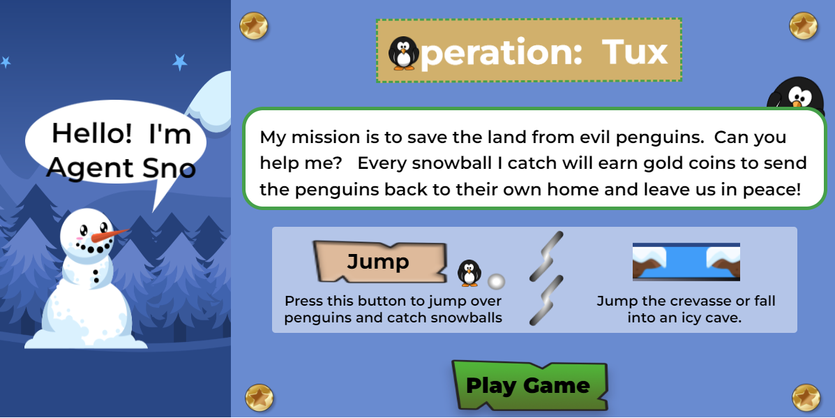
Operation Tux
Operation Tux is a simple jump and run game created using Google Web Designer for an assignment from Southern Cross University for the module Designing the User Experience.
It is designed to be played on a computer.
The snowman 'Agent Sno' has to jump over rolling penguin missiles and dodge snowballs whilst not falling down into an icy crevasse.
Try your luck!!
Comments
Log in with itch.io to leave a comment.
Home Page
The Arrow clearly directed my eyes to the Start button that tells me that’s the button I should be clicking. I could easily navigate to another page.
The animation of the Penguin rolling in was very creative and the idea of replacing the letter "O" was brilliant. I also enjoyed the feedback sound I got when i clicked on a button.
Lastly, the Mouse over on all buttons was good except for the color combination you had for the credits button. The purple looked more of gradient color then a solid color.
Credits Page
The auto scroll on the credits page was a good idea but it was too fast to read all the writing. I would've preferred it to either be scrollable so I can manually scroll or decrease the speed on the auto scroll.
The Heading "Credits" should’ve been always shown whilst the auto scroll was happening. So, you could've masked the Credits shown to disappearing before it reached the Heading "Credits" and I would've preferred the ending message "Thank You for Playing" centred on the Game Screen with the blue text box color stretched out from top to bottom of the game screen.
Lastly, a Home or Back button should've been placed to return to the home page.
Exit Page
I like the little dialog message you had on the exit page and if it were possible, I would suggest having the snowman with a sad face because your about to exit the game.
The "YES" Navigation to the credits page was good but the "NO" navigation should've sent me to the Instructions page instead of automatically starting the game. And this applies to all Exit buttons throughout the while game.
And a Sad sound feedback can be put on the page to play on landing on the page.
Instructions Page
The page is very informative and Easy to read.
You should include a Home or Back button to return to the home page.
Otherwise, I enjoyed the read.
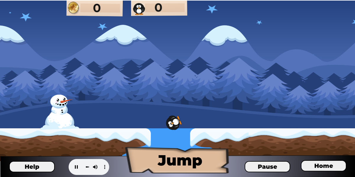
Game page
I like the help button, pause button, and home button but the Sound control button should've been expended a bit to show the whole sound bar and the Jump button should've been more interactive when clicked like shrunk in size.
The sound feedback when the stars are collected was good with the coin animation floating to the top that adds up the total collected.
The Message pop-ups when penguins were missed was great.
The Score tally was good as well.
And the soundtrack was enjoyable to listen to.
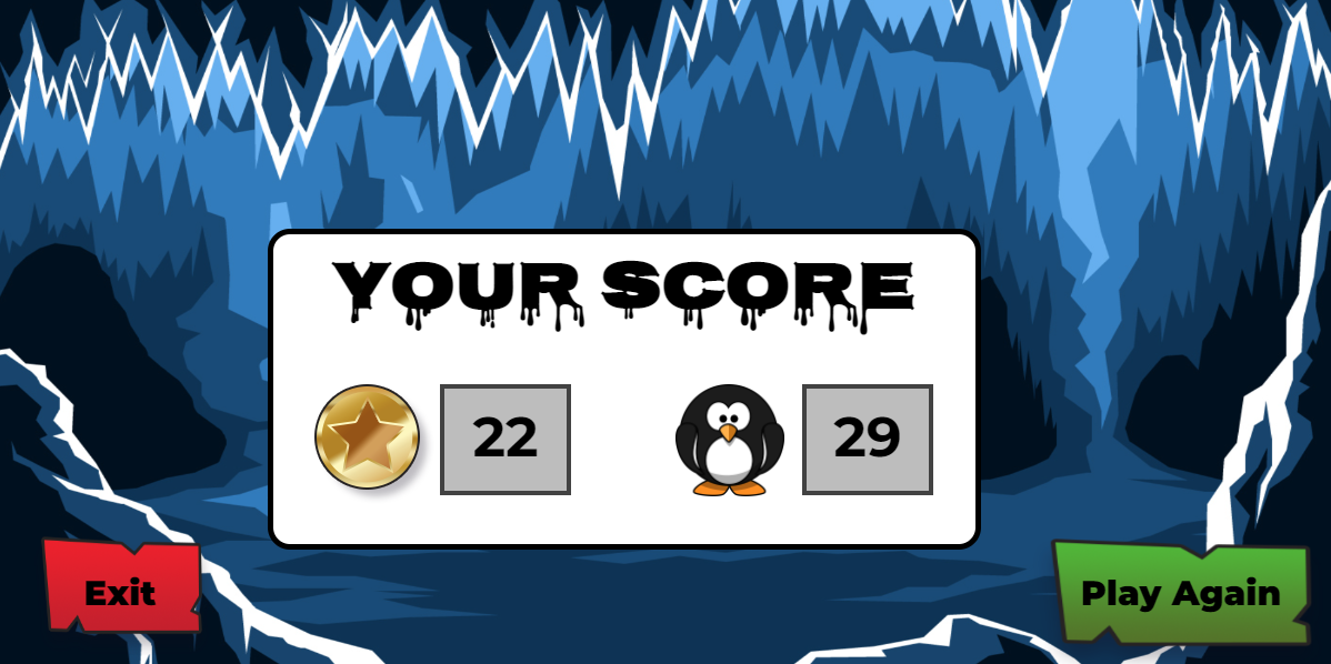
Results Page
The sound feedback used when you lose was great. And the continuing of the soundtrack was great.
I would've preferred to only have the animation of the Snowman itself then show the Game Over Message to be shown above the Score Tally.
And the Play Again should be made to catch the eye direction of the users.
But Overall, Great job on the game Tracey.
I enjoyed playing the game with the sounds.
Home page
Score
10
Comment
The graphics were fantastic as they gave me an idea of what I would experience in the game. My eyes were directed to the start button which I thought was fantastic as you created an animation behind it that drew my eyes to it, so I knew how to start the game.
Credits page
Score
4
Comment
Accessed the credit page through the homepage, after looking at the credits I was unable to go back to the homepage. I felt that this would impact the user experience as I accessed it through the homepage I thought after looking at the credits I would be able to go back to the home page.
Help page
Rating
9
Comments
The page gave me all the required information to play the game. I loved the button was interactive as the text changed colour once my mouse hovered over it.
Game scene
Rating
8
Comments
I enjoyed the game, the continuation of the large text at the centre of the screen which displayed “Missed” or “Bonus!!” was not required that temporarily distracted me, to me it was obvious that I had missed the penguin, or I had just collected a coin and fell that it is unnecessary for the text to remain there. I think that the text displaying whether the user has either missed the penguins or collected money should only be there temporarily before disappearing.
The ability to access the home, help, pause and audio button made this a very user-friendly page however I personally struggle to see how I could change the audio during gameplay as it is a fast-paced game.