Planet Beta
Planet Beta is a grey box prototype required for assessment 2 as part of the Developing User Experience. The alien is a prototype of the Unity alien asset that will be used for assessment 3 AR project.
Planet Beta is a grey box prototype required for assessment 2 as part of the Developing User Experience. The alien is a prototype of the Unity alien asset that will be used for assessment 3 AR project.
Comments
Log in with itch.io to leave a comment.
Tracey,
Well done.
Everything from the sound used to the layouts of content.
I like how you hade less items on the main screen so it looks like its not all squeezed up together. The sound used very well goes with the theme of the game. The button layout in the control of your Alien is nice.
And changes I would suggest is the colour of the some buttons is too transparent that the white in the background hits the white text so its not real visible also with your title, it could've used a different font or stretched out a bit
But otherwise.
Great Job!!!...
Tracey, i really liked the way you presented the outer space in the first scene but the animated objects should have been some meteors or space objects. The design of alien is also inspiring. All the buttons are working as required. In my opinion, the background in main scene could have been better as used in first page because seeing the alien move in relevant background could have been much appealing as a user.
Overview
Tracey, you have made an interface that largely follows the rules of UX if I were to nit-pick I would say that the spacing between each button on the student page is not the same and the animations provide a distraction as my eyes are drawn away from the buttons to look at the animations.
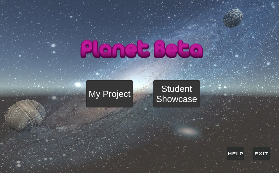
Home page
Buttons
Interactivity
The sound effects and animations both worked well to gather to make a good user experience this was because of added interactivity and enabled an audio channel for the game.
Colour
I found that the colour of the background went well with the background as a dark colour (grey).
Location
The buttons were at the centre of the page, with the combination of the buttons and title provide a good amount of whitespace within the page.
Title
I felt that the title had a colour that had contrasted with the dark background which “popped” out of the screen because of the background the purple title was easy to see for users with poor eye sight.
Background
Theme
The background of the game was a space-related image which goes well with the theme
My project page
Buttons
Interactivity
The buttons all made an interactive sound once clicked which this improved the usability of the buttons. Each button changed colour (lighter grey) once hovered hover, this colour would work for the visually impaired and
Colour
The colour was grey which clashes with the murky blue as the background as the colours we are supposed to do have contrast which positively affects user interest in the product.
Location
The location of the buttons was at the bottom of the page, and the structure of all the buttons was not continuous as the buttons were in three groups, the lack of continuity could negatively affect user experience. The middle group of buttons is also at a different height compared to the button groups at the left and right of the screen.
Overall I do not have many negative things to say because it is a good design. Great Job!
Resources
https://uxplanet.org/color-matters-6-tips-on-choosing-ui-colors-260f56197a7b
awesome work Tracey a lot to be inspired with. special sounds and the moving planets seem so good and smooth. however, on the student showcase page on hovering the buttons, some buttons overlap each other and overlap other buttons. and the buttons on the home page would have been perfect with the same size for the aesthetic feeling. I had to be very picky to come up with criticisms. Thank you